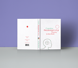
Cognitive Personality Theory
All Company Branding; Infographic & Illustrative Design; Full Book Design & More


The Book Jacket and Typography
The first design ideas created for the book jacket of 'Cognitive Personality Theory'.


Deciding on a sleek simplistic portrait, recognisable especially within the psychology sector, with the key element of the theory front and centre- the four sides of the mind, all with equal in importance accross all personalities.


Infographic design
below are just a few examples of the infographics designed for the theory, so as to ensure the client's copyright was not breached.


Logo / Brandmark design
I actually decided to create the logo design after the development of the icons and infographic elements and 'colour key codes' I created for the publication and youtube channel, as I decided it was best to:
Ensure the colour theme reflected the infographic design element of the publication and youtube icons. (Please scroll to see infographics).
Find a font and colour scheme that reflected the company's overall theme of 'approachable' science, resulting in the choice of 'Rod Regular' and adding a hand-drawn adaptation to the central human part of the brand name 'Personality'.


The green represents 'sensing' and red, 'intuition', both functions being on opposite ends of the cognitive spectrum. Myself and the client both felt it was important to incorporate complimentary colours in the logo itself to reflect the balance and equal importance between utilising each end of and between the spectrum. We didn't want to have a childlike gradiented text from red to green; orange to blue, so this was our happy subtly suggestive compromise.
